
Windows 11 UI Mismatches: A Quick Listicle

Windows 11 UI Mismatches: A Quick Listicle
The aesthetic of Windows 11 has changed and may continue to change with updates. Some of these changes have been great, and others have been controversial.
No matter what, nothing matches. Let’s have a look at xx different Windows 11 design inconsistencies that are just annoying.
Disclaimer: This post includes affiliate links
If you click on a link and make a purchase, I may receive a commission at no extra cost to you.
Why Does Windows 11 Have So Many Design Inconsistencies?
Windows 11 is in the process of moving much of its UI elements over to a new framework, known as WinUI.
This change is happening piece by piece, and certain design elements either aren’t finalized or are inconsistent with design elements found in other areas.
This results in mismatching UI designs and, in some cases, poor performance. We’ve written abouthow Windows 11’s UI transition can affect performance , as well as how Microsoft plans to address this.
Due to this, it’s likely some of these elements will be corrected before the end of Windows 11’s lifespan.
Still, let’s have a look at the more noticeable design flaws present in Windows 11.
1. An Outdated Control Panel
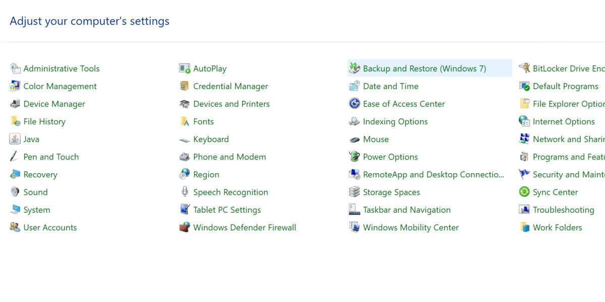
Let’s start off with one you very well may have noticed already. Found in the Windows 11 control panel is an option to backup and restore Windows 7.
Giving the user the option to open the Windows 7 Backup and Restore tool in Windows 11 is a bit of an eyebrow-raiser. This tool functions fine for Windows 11, and the error really is only in the name.
One would think such a minor text element would be an easy fix, but here we are.
2. Menu Differences on Lock Screen
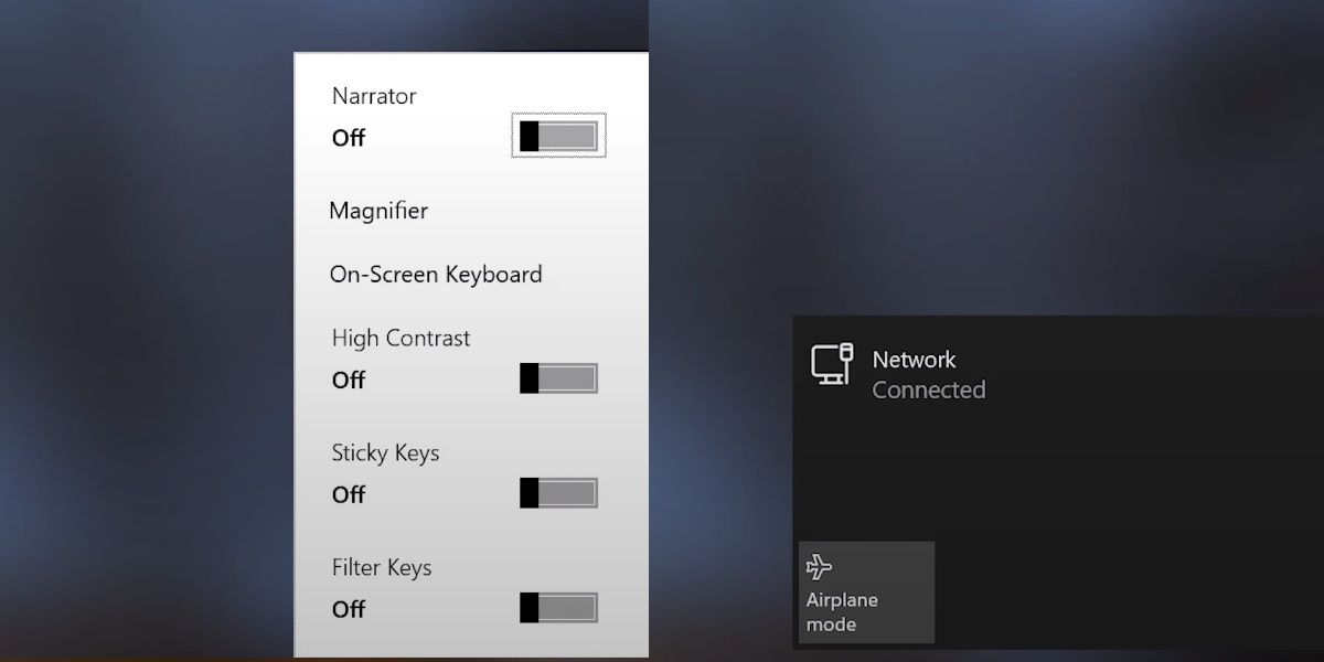
Here’s another one that’s hard to miss. On the lock screen, the network menu has a nice dark shade, regardless of if your system is in dark mode or not.
The accessibility menu is a bright white color, again ignoring your system’s dark mode settings. This creates a noticeable contrast when opening two menus that are right next to each other.
3. Taskbar Oddities
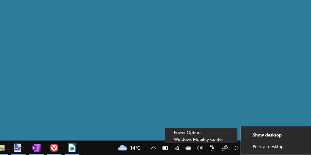
The taskbar is full of some interesting quirks. First, the context menu will appear slightly differently depending on if you’re right-clicking the taskbar, an icon, or a system icon. Additionally, the flyouts for different system menus can adhere to different spacing, sizing, or brush coloration.
Depending on how up-to-date your version of Windows 11 is, you may even see Windows 10-era context menus on different system icons.
4. UI Ignoring Dark Mode
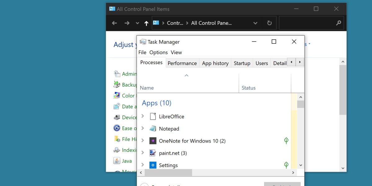
When Windows 11 is set to dark mode, many default apps don’t care.
Elements such as the control panel, the task manager, troubleshooting apps and more have no dark mode equivalent. They will continue to display a bright white color scheme, clashing against the rest of your system.
This is a prevalent issue that will show itself in other elements on this list. It’s worth learninghow to enable and customize dark mode on Windows 11 yourself to see how many default programs and apps don’t behave.
5. Settings Is a Mess
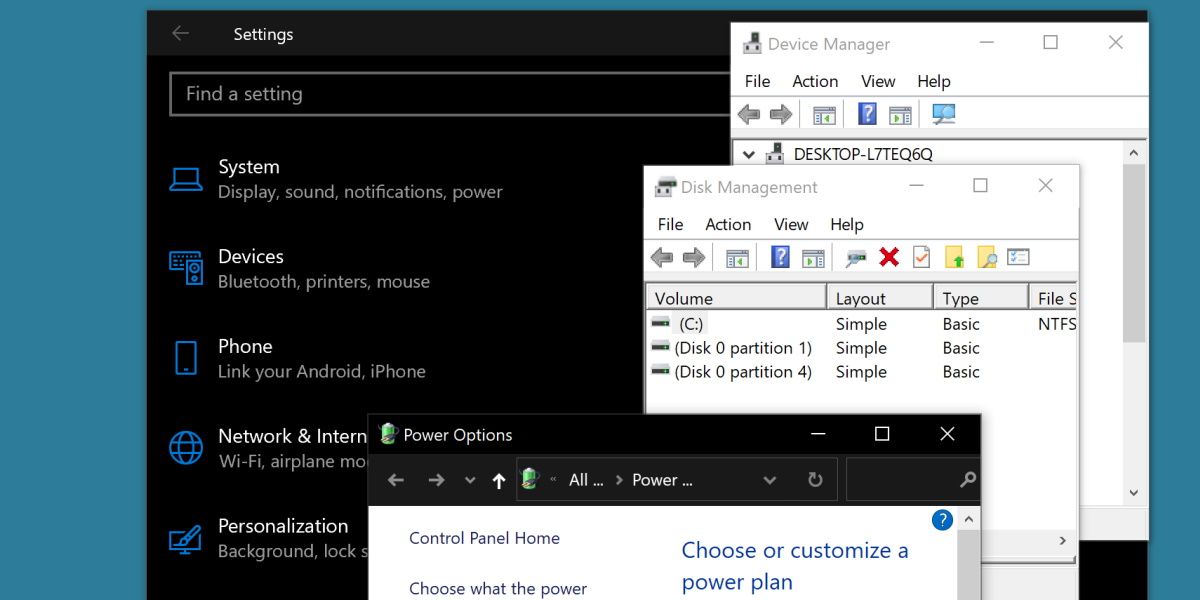
The settings menu is full of UI design inconsistencies. The overall menu itself has been brought in line over the years, with many functions now adhering to the same sleek design decisions.
It’s the amount of settings applications you can launch from this menu that show a wide range of different design elements.
From Disk Management resembling something from XP, to Device Manager still showing signs of the Windows 10 days, you can find something a little different in every submenu of the Windows 11 settings menu.
6. Different Context Menus
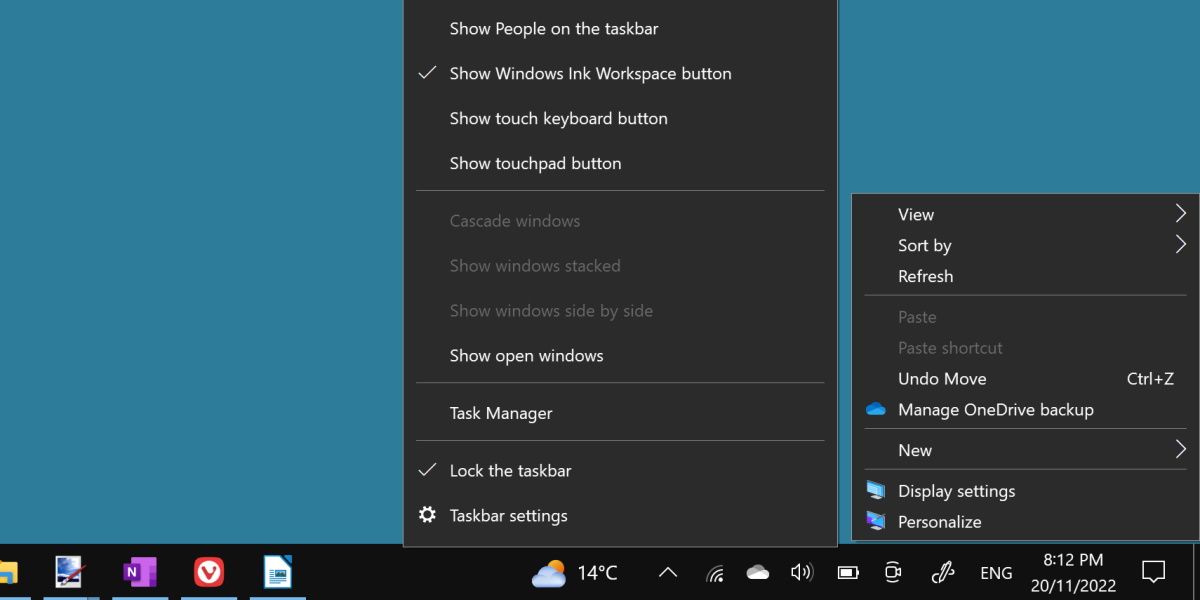
This one may seem minor, but you can observe these subtle differences across all of Windows 11.
The context menu adheres to different spacing and styling rules depending on where you’re opening it. Right-click on your taskbar, and then try right-clicking on your desktop to see the difference.
The spacing and general sizing of the context menu is different, but it doesn’t stop there.
Right-clicking on a taskbar icon will produce yet a different looking context menu. Even more, depending on your version of Windows 11, you can see a different context menu in the file explorer and even on different desktop icons.
7. On-Screen Keyboard
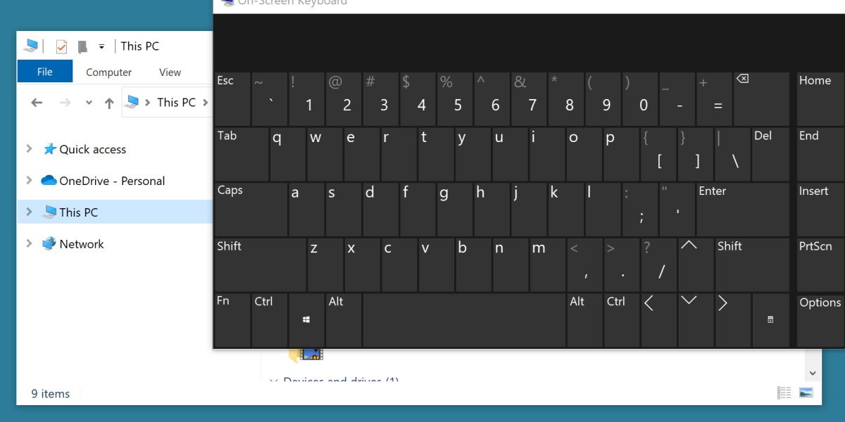
In an interesting inverse to the rest of the UI inconsistencies, the on-screen keyboard actually sticks to a dark theme even if you’ve selected a light theme.
There’s another layer to this inconsistency, though. The window header itself uses spacing and design principles from Windows 10 while ignoring the system theme and always appearing in light mode.
So you have a light mode header clashing with the dark mode program, neither of which supports light or dark mode to begin with.
Windows 11 Could Use Some Tidying Up
Considering some of these UI mistakes have existed for multiple versions of Windows, it’s unlikely everything on this list will be rectified. Still, Windows 11 is a developing platform, with new updates coming regularly.
Hopefully, Windows 11 will be a lot more consistent by the time it reaches the end of its lifespan.
Also read:
- [New] 2024 Approved Top 5 iOS Emulators That Bring Your Favorite PSP Worlds to Life
- [Updated] 2024 Approved Dive Into Old Content YouTube Video Recovery Guide
- 1. Top 65 Prime Day Game Discounts of 2024: Last Chance Bargains! - PCMag
- Addressing Unauthorized Profiles on PCs: Win10/11 Guide
- Boost Your Mobile Film Game Best 9 Camera Add-Ons For Vloggers
- Correcting HP Display Flicker Anomalies
- Escape Heavy Requirements: Tiny11 Delight
- Handling DXGI_ERROR_DEVICE_REMOVED in Win 10 & 11
- In 2024, All You Need To Know About Mega Greninja For Oppo A78 5G | Dr.fone
- In 2024, The Easy Way to Change and Upgrade iPhone's Ringtones
- Strategies for Restoring Secure File Connections on Win
- Transforming ESD Format to Compatible Windows ISOs
- Understanding Video Quality: Distinguishing 1080I Vs. 108
- Unlocking Windows MS Office: Erase Error Code 0X80041015
- Title: Windows 11 UI Mismatches: A Quick Listicle
- Author: David
- Created at : 2024-11-01 01:21:56
- Updated at : 2024-11-02 04:23:55
- Link: https://win11.techidaily.com/windows-11-ui-mismatches-a-quick-listicle/
- License: This work is licensed under CC BY-NC-SA 4.0.