
Step-by-Step Guide: Creating Visual Charts with Microsoft Excel

Step-by-Step Guide: Creating Visual Charts with Microsoft Excel
Quick Links
Graphs and charts are useful visuals for displaying data. They allow you or your audience to see things like a summary, patterns, or trends at glance. Here’s how to make a chart, commonly referred to as a graph, in Microsoft Excel.
How to Create a Graph or Chart in Excel
Excel offers many types of graphs from funnel charts to bar graphs to waterfall charts . You can review recommended charts for your data selection or choose a specific type. And once you create the graph, you can customize it with all sorts of options.
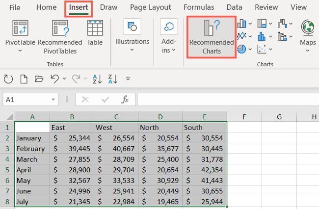
Start by selecting the data you want to use for your chart. Go to the Insert tab and the Charts section of the ribbon. You can then use a suggested chart or select one yourself.
Choose a Recommended Chart
You can see which types of charts Excel suggests by clicking “Recommended Charts.”
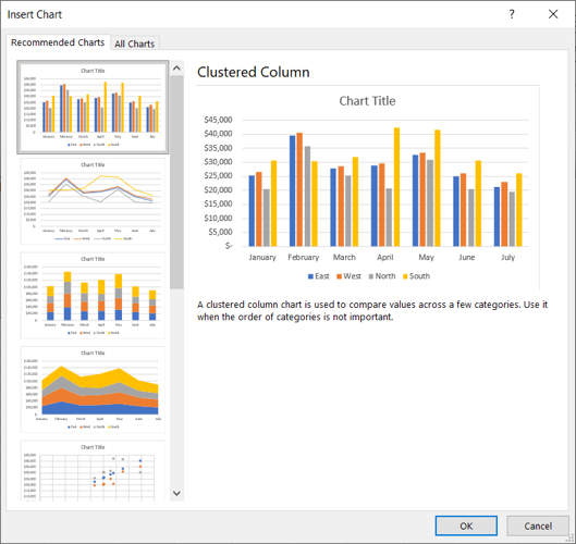
On the Recommended Charts tab in the window, you can review the suggestions on the left and see a preview on the right. If you’d like to use a chart you see, select it and click “OK.”
Choose Your Own Chart
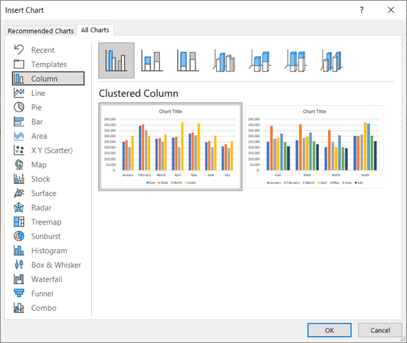
If you would prefer to select a graph on your own, click the All Charts tab at the top of the window. You’ll see the types listed on the left. Select one to view the styles for that type of chart on the right. To use one, select it and click “OK.”
Another way to choose the type of chart you want to use is by selecting it in the Charts section of the ribbon.

There is a drop-down arrow next to each chart type for you to pick the style. For example, if you choose a column or bar chart , you can select 2-D or 3-D column or 2-D or 3-D bar.

Whichever way you go about choosing the chart you want to use, it will pop right onto your sheet after you select it.
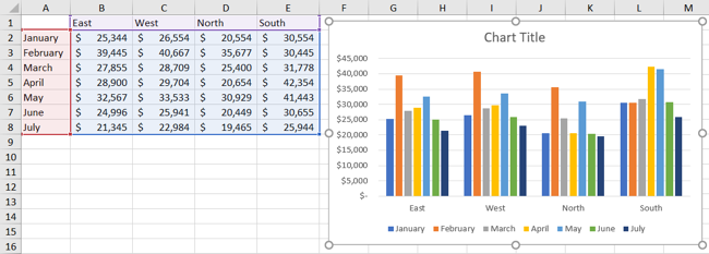
From there, you can customize everything from the colors and style to the elements that appear on the chart.
Related: How to Make a Bar Chart in Microsoft Excel
How to Customize a Graph or Chart in Excel
Just like there are various ways to select the type of chart you want to use in Excel, there are different methods for customizing it. You can use the Chart Design tab, the Format Chart sidebar, and on Windows, you can use the handy buttons on the right of the chart.
Use the Chart Design Tab
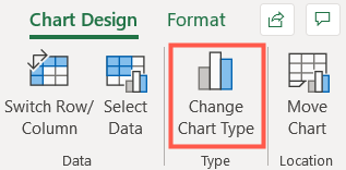
To display the Chart Design tab, select the chart. You’ll then see many tools in the ribbon for adding chart elements, changing the layout, colors, or style, choosing different data, and switching rows and columns.

If you believe a different type of graph would work better for your data, simply click “Change Chart Type” and you’ll see the same options as when you created the chart. So you can easily switch from a column chart to a combo chart , for instance.
Use the Format Chart Sidebar
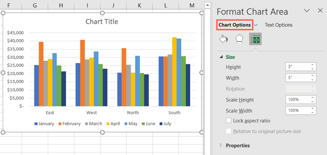
For customizing the font, size, positioning , border, series, and axes, the sidebar is your go-to spot. Either double-click the chart or right-click it and pick “Format Chart Area” from the shortcut menu. To work with the different areas of your chart, go to the top of the sidebar.
Related: How to Lock the Position of a Chart in Excel
Click “Chart Options” and you’ll see three tabs for Fill & Line, Effects, and Size & Properties. These apply to the base of your chart.
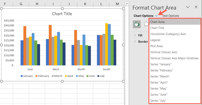
Click the drop-down arrow next to Chart Options to select a specific part of the chart. You can choose things like Horizontal or Vertical Axis, Plot Area, or a Series of data.
Click “Text Options” for any of the above Chart Options areas and the sidebar tabs change to Text Fill & Outline, Text Effects, and Textbox.
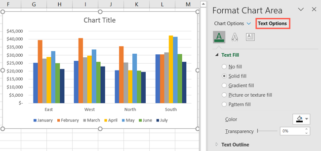
For whichever area you work with, each tab has its options directly below. Simply expand to customize that particular item.
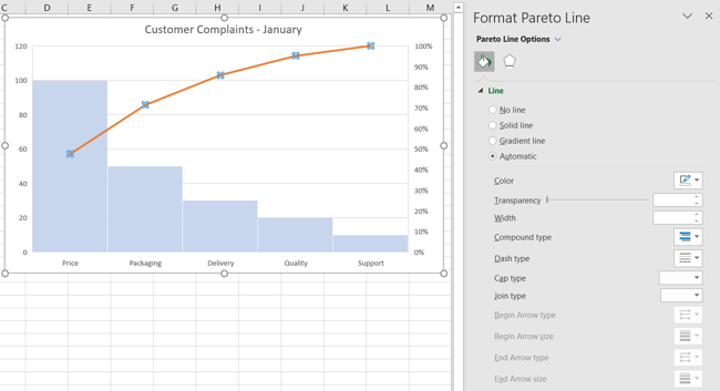
As an example, if you choose to create a Pareto chart , you can customize the Pareto line with the type, color, transparency, width, and more.
Use the Chart Options on Windows
If you use Excel on Windows, you’ll get a bonus of three helpful buttons to the right when you select your chart. From top to bottom, you have Chart Elements, Chart Styles, and Chart Filters.
Chart Elements: Add, remove, or position elements of the chart such as the axis titles, data labels , gridlines, trendline, and legend.
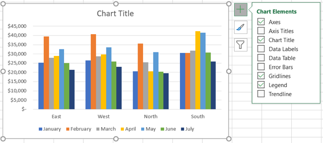
Chart Styles: Select a theme for your chart with different effects and backgrounds. Or choose a color scheme from colorful and monochromatic color palettes.
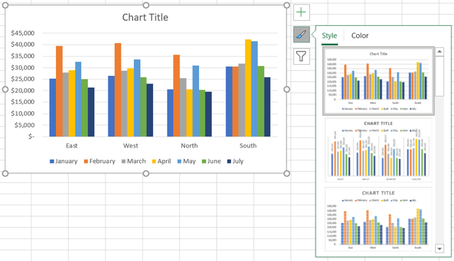
Chart Filters: For viewing particular parts of the data in your chart, you can use filters. Check the boxes under Series or Categories and click “Apply” at the bottom to update your chart and only include your selections.
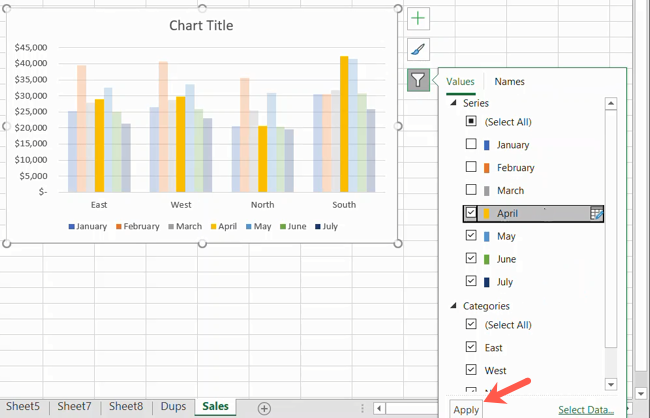
Chart Filters are only available for certain types of charts.
Hopefully this guide will get you off to a great start with your chart. And if you use Sheets in addition to Excel, learn how to make a graph in Google Sheets too.
Also read:
- [New] 2024 Approved FIFA Highlights & Trends Charting on YouTube
- [New] Basic Tactics to Archive Webcam Chats
- [New] In 2024, Captivating Clicks The Top 8 YT Thumbnails to Use
- [Updated] Adaptive Gaming Techniques by Pros for 2024
- [Updated] Premiere Video Editing Options for App Developers
- [Updated] Twitter Connect Optimizing Your TikTok Content
- Creating a Consistent Note-Taking Space in Windows 11
- Display Diversity: Adjusting Each Monitor's Aesthetic in WIN 10/11
- Elevate Your Developer Skills with GitHub Desktop on Windows OSes
- Mastering Windows Patching with 4 Essentials
- Save Big with Samsung's 8TB Portable SSD at a Whopping 36% Off in Our Amazon Exclusive | Insights
- The Ultimate Guide to Password-Less Windows 11 RDP
- The Ultimate Guide: Automatic Fixes for Wake-Up Sound Issues
- Updated In 2024, Capture the Moment Freezing Frames in Videos with Ease
- Winning Choices: Top Windows Tools For Video Conversion
- Title: Step-by-Step Guide: Creating Visual Charts with Microsoft Excel
- Author: David
- Created at : 2025-01-03 20:01:02
- Updated at : 2025-01-06 19:07:57
- Link: https://win11.techidaily.com/step-by-step-guide-creating-visual-charts-with-microsoft-excel/
- License: This work is licensed under CC BY-NC-SA 4.0.