
Step-by-Step Guide: Constructing a Location-Based Geographic Visualization with Excel
Step-by-Step Guide: Constructing a Location-Based Geographic Visualization with Excel
Quick Links
Charts are helpful for visual displays of your data. They can make viewing and analyzing data easier, especially for your audience. So for geographical data, why not use the map chart type in Microsoft Excel?
Whether you want to display populations in several countries for your sales team or abbreviations for the United States for your elementary school class, you can create a map chart easily in Microsoft Excel. You can then format it with labels, a legend, and an appropriate color scheme.
Get Your Data Ready
Like with other chart types in Microsoft Excel, it’s best to start with populated data. This allows you to select the cells containing that data and simply insert the chart for it.
Select a single data type for the map. Like the examples listed above, this can be the population or abbreviation that you can obtain from the built-in geography data type in Excel . Or, alternately, it might be your sales amounts, number of stores, average operating costs, or other data you have already prepared in your spreadsheet.
While you can use the chart for smaller areas, such as cities, the map won’t be as effective. You’ll only see dots representing those types of locations. The map chart in Excel works best with large areas like counties, states, regions, countries, and continents.
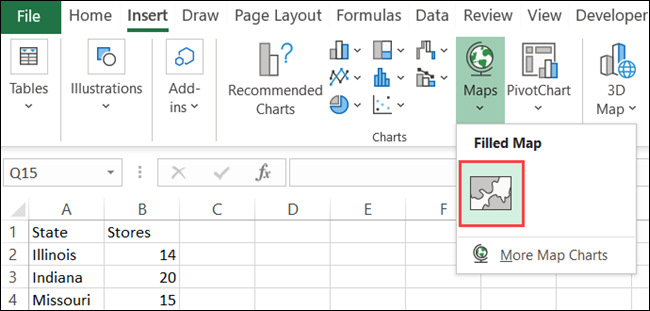
Create the Map Chart
When you’re ready to create the map chart, select your data by dragging through the cells, open the “Insert” tab, and move to the “Charts” section of the ribbon. Click the drop-down for “Maps” and choose “Filled Map.”
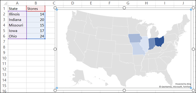
Your newly created chart will pop right onto your sheet with your data mapped.
Format the Map Chart
The next steps include formatting your map to include useful components and a color scheme. You can add a title, some labels, a legend, and a style.
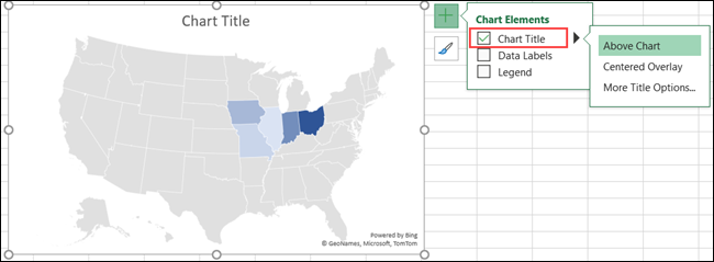
Add a Title
If your map contains the default “Chart Title,” you can simply click that text box on the map and type in your own title. If the map does not include a title, you can add one easily as well as changing its position.
Select the chart and click “Chart Elements” (“+” icon) on the right. Check the box for “Chart Title,” then enter the title in the text box that appears on the map.
Hover your cursor over the arrow to the right of “Chart Title” in the Chart Elements box and choose a different position for the title if you like.
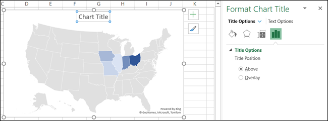
You can also select “More Title Options,” which will display a sidebar on the right. In this spot, you can choose the position, use a fill color, or apply a text outline.
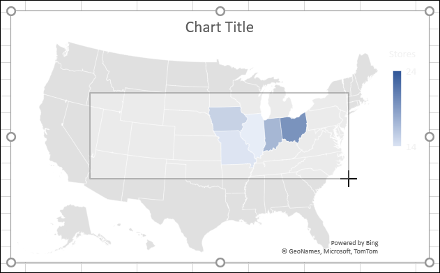
Include Data Labels
If the data you’re displaying on the map is small enough, you may want to include data labels . These will show the data directly on each map location.
Select the chart and click “Chart Elements” on the right. Check the box for “Data Labels.”
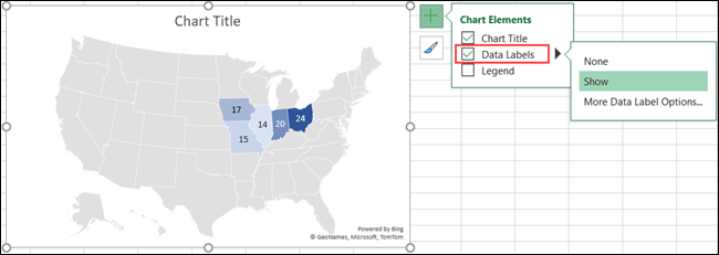
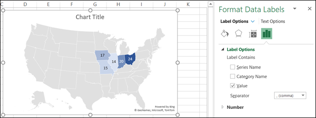
To adjust the text and options for the labels, select “More Data Label Options.” Like with the chart title, the right-hand sidebar will open with formatting features for the labels.
Insert a Legend
One more helpful element for almost any chart is a legend. This useful tool is a key to the data that displays on the chart.
Select the chart and click “Chart Elements” on the right. Check the box for “Legend.”
Hover your cursor over the arrow to the right of “Legend” in the Chart Elements box and choose a position for the legend.
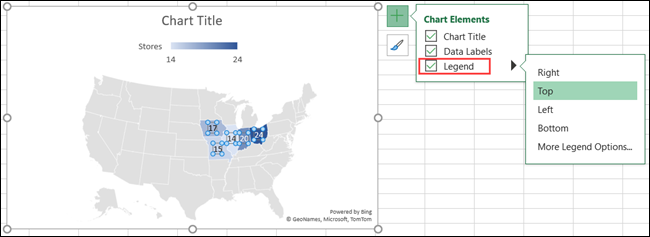
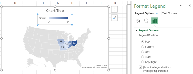
You can also select “More Legend Options” to open the sidebar and format the text and additional options.
Apply a Style
The map chart is pretty basic in its color, but you can spruce it up with a theme or color scheme.
Select the chart and click “Chart Styles” (found on the paintbrush) on the right. Click “Styles” to scroll through premade themes or “Color” to pick a colorful or monochromatic scheme.
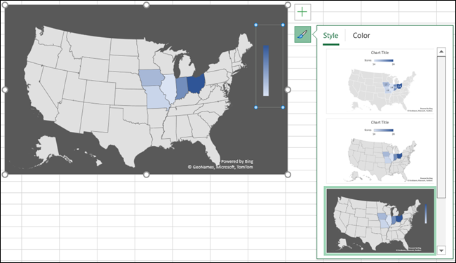
Whichever you choose, you’ll see your map update immediately.
Move, Resize, Edit, or Delete the Map
You can easily move the map chart anywhere you want on your sheet. Just select and drag it to its new spot. If you want to prevent changes, you can lock the Microsoft Excel chart in place. And to resize the chart, drag one of the corners or edges.
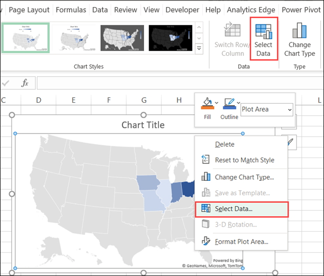
To edit the data that displays on the map, for example, if you add more locations, right-click the chart and click “Select Data.” Alternatively, you can go to the “Chart Design” tab and click “Select Data” in the ribbon.
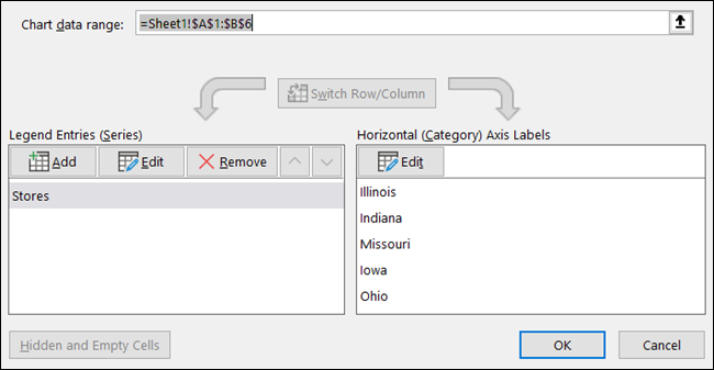
Enter the cells in the “Chart Data Range” box at the top, or drag your cursor through the cells. Click “OK” when you finish.
If you decide that you don’t want to use the map chart after all, you can remove it easily. Select the chart and hit your Delete key or right-click and pick “Cut.”
If you want to display geographical data on your Excel sheet, the map chart is a terrific visual tool. For other types of data, take a look at how to make a bar chart in Microsoft Excel .
Related: How to Make a Bar Chart in Microsoft Excel
Also read:
- [New] 2024 Approved Audiophile Tools Best Audio Interfaces for Podcasters
- [New] 2024 Approved The Complete Checklist for Internet Broadcast Preservation
- [New] Analyzed The Finest Screen Capture Software for macOS
- [New] Lead the Pack Identifying the Best Facebook Timetabling Software
- [Updated] Max 360 or Hero 11? Decoding the Superior GoPro Video Quality for 2024
- Android's Premier 8 Apps Harmonizing Free & Paid Videomosaic Experience for 2024
- Mastering PowerToys: Navigating Globally, Peering Deeply
- Snag a Discounted iPad at $199 - Exclusive Amazon Labor Day Deals Featured
- The Six Leading Compact Video Editor Tools for Seamless Editing on the Go
- Top TS Encoder: Swift & Simple Video Conversion From/To TS Format
- Turn Your Music Collection Into Ogg Format at No Cost: A Simple Guide on MP3-to-Ogg Transformation
- Ultimate 8 Screen Recorder Apps Compatible with Mac & Windows PC: Top Picks for Easy Recording
- Ultimate Guide: Top 7 Excellent Choices Instead of Kodi
- Ultimate Guide: Top DVD Ripper Tools for Seamless Plex Media Server Integration
- Title: Step-by-Step Guide: Constructing a Location-Based Geographic Visualization with Excel
- Author: David
- Created at : 2025-01-03 19:03:51
- Updated at : 2025-01-06 20:56:29
- Link: https://win11.techidaily.com/step-by-step-guide-constructing-a-location-based-geographic-visualization-with-excel/
- License: This work is licensed under CC BY-NC-SA 4.0.