
Mastering Waterfall Charts: A Step-by-Step Guide on Tailoring Visuals in MS Excel

Mastering Waterfall Charts: A Step-by-Step Guide on Tailoring Visuals in MS Excel
Quick Links
If you want to create a visual that shows how positives and negatives affect totals, you can use a waterfall chart, also called a bridge or cascade chart. You can easily create and customize a waterfall chart in Microsoft Excel.
When to Use a Waterfall Chart
You might be wondering whether the data that you have in your spreadsheet is appropriate for a waterfall chart. If you have a starting value with a positive and negative series that affects the final outcome, then a waterfall chart is for you.
Here are just a few common uses:
- Checking accounts: Use a starting balance, add credits, subtract debits, and show the ending balance.
- Inventory: Enter a starting amount, add received shipments, subtract units sold, and show the ending amount.
- Products: Display a starting total, subtract damaged units, add refurbished units, and show the sellable total.
- Revenue: Use a starting amount, add income, subtract expenses, and show the total remaining.
Related: How to Automatically Generate Charts in Google Sheets
Create a Waterfall Chart in Excel
If you have data that would fit perfectly into a waterfall chart for a useful visual, let’s get right to it! For this tutorial, we’ll use a checking account as an example.
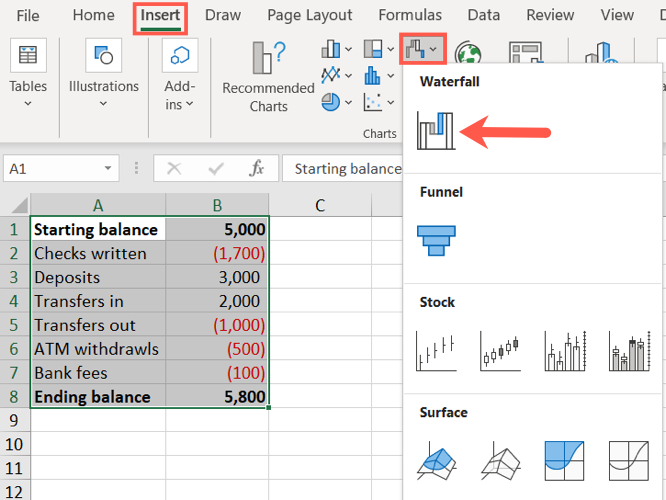
Start by selecting your data. You can see below that our data begins with a starting balance, includes incoming and outgoing funds, and wraps up with an ending balance. You should arrange your data similarly.
Go to the Insert tab and the Charts section of the ribbon. Click the Waterfall drop-down arrow and pick “Waterfall” as the chart type.
The waterfall chart will pop into your spreadsheet.
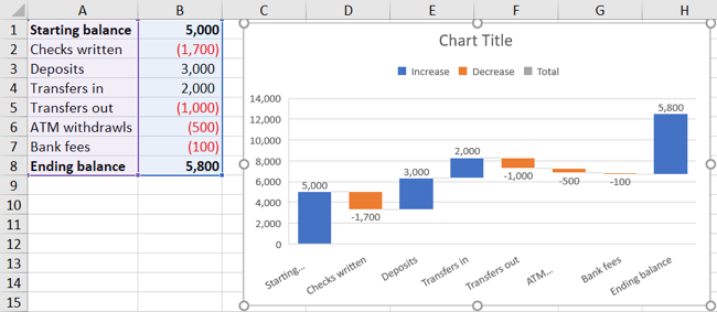
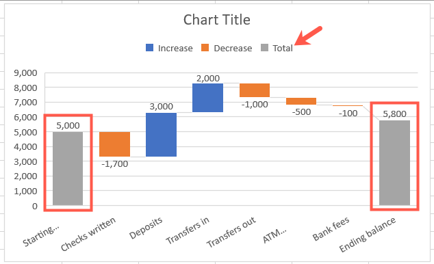
Now, you might notice that the starting and ending totals don’t match with the numbers on the vertical axis and aren’t colored as Total per the legend. Not to worry—this is a simple fix!
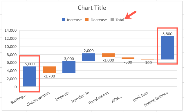
Excel recognizes those starting and ending amounts as parts of the series (positives and negatives) rather than totals.
To fix this, double-click the chart to display the Format sidebar. Select the bar for the total by clicking it twice. Click the Series Options tab in the sidebar and expand Series Options if necessary.
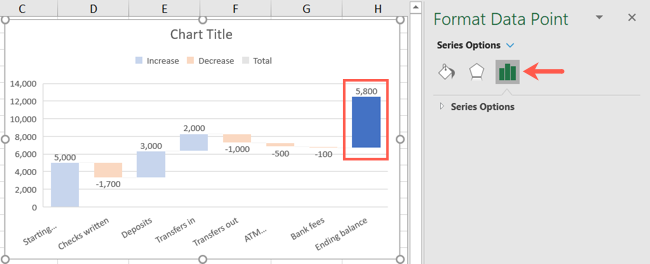
Check the box for “Set as Total.” Then, do the same for the other total.
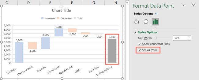
Now, you’ll see that those bars match up with the vertical axis and are colored as Total per the legend.
Customize a Waterfall Chart
Like other chart types in Excel, you can customize the design, colors, and appearance of your chart. If this isn’t something you’ve done yet in Excel, here are the basics for customizing your chart.
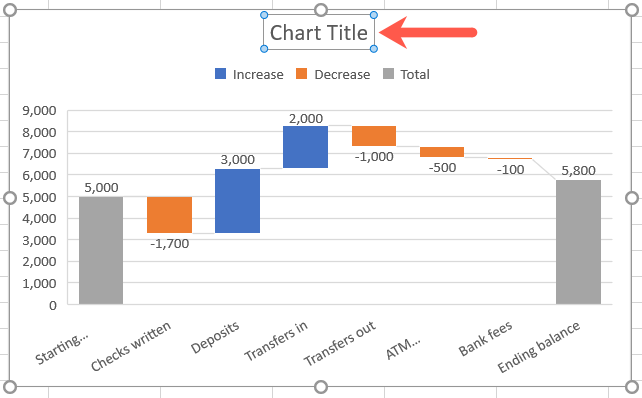
If you’d like to start by changing the title, click the Chart Title text box.
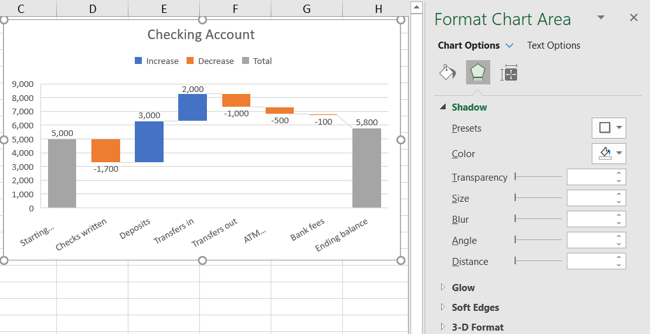
Double-click the chart to open the Format Chart Area sidebar. Then, use the Fill & Line, Effects, and Size & Properties tabs to do things like add a border, apply a shadow, or scale the chart.
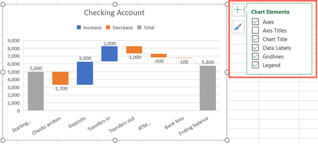
Select the chart and use the buttons on the right (Excel on Windows) to adjust Chart Elements like labels and the legend, or Chart Styles to pick a theme or color scheme.
Select the chart and go to the Chart Design tab. Then, use the tools in the ribbon to select a different layout, change the colors, pick a new style, or adjust your data selection.

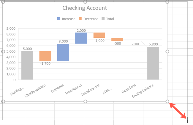
You can also move your chart to a new spot on your sheet by simply dragging it. And, to resize your chart, drag inward or outward from a corner or edge.
For help with other chart types, take a look at how to make a bar chart in Excel or create a combo chart .
Also read:
- [Updated] How to Flawlessly Merge Streamlabs & OBS on Mac
- [Updated] VisualSnap Win11 Instant Desktop Capture & Save for 2024
- 2024 Approved Expert iPhone Macro Photography Tips and Tricks
- Conversione Gratuita Da MXF a MPEG Online Con Movavi - Scopri Come!
- Duel for Dominance Physical vs Virtual Spectacle
- Enabling Write Access for Files on Windows 10/11
- FFmpeg's Audio Recapture Challenge for 2024
- Fix It Faster: 6 Proven Windows Techniques for Restoring Your Internet Connections
- Guide to Avoid Automatic BIOS Mode at Windows Start-Up
- How to Track Realme C55 Location by Number | Dr.fone
- In 2024, Latest way to get Shiny Meltan Box in Pokémon Go Mystery Box On Tecno Spark 10 4G | Dr.fone
- Mastering the Fix for Windows Activation Error 0X8007251D
- Navigating the Maze of Steam's E84 Error
- Overcoming Blank Screen Glitch in Windows OS
- Overcoming Volume Regulation Failure in Win 10/11
- Reclaim Control: Tackling Scheduler Malfunctions
- Tecno Spark 20C ADB Format Tool for PC vs. Other Unlocking Tools Which One is the Best?
- Three Column Widget Configuration in Modern Windows 11
- Unlock the Secrets: Getting Counter-Strike 2 to Start Without Glitches
- Title: Mastering Waterfall Charts: A Step-by-Step Guide on Tailoring Visuals in MS Excel
- Author: David
- Created at : 2025-01-02 16:47:30
- Updated at : 2025-01-06 21:00:41
- Link: https://win11.techidaily.com/mastering-waterfall-charts-a-step-by-step-guide-on-tailoring-visuals-in-ms-excel/
- License: This work is licensed under CC BY-NC-SA 4.0.