
Enhance Your Excel Visualizations: Adding Personalized Data Labels Easily!

Enhance Your Excel Visualizations: Adding Personalized Data Labels Easily!
Quick Links
Key Takeaways
While adding a chart in Excel with the Add Chart Element menu, point to Data Labels and select your desired labels to add them. The “More Data Label Options” tool will let you customize the labels further. To customize data labels for an existing chart, use the Chart Elements button.
When you create an Excel chart that contains a ton of data, it can be difficult to decipher it all at a glance. One helpful way to point out information is using data labels for a series of data points. We’ll show you how to use data labels here.
You can choose which series or points to use data labels for and select their positions. For example, data labels can become part of the bars on a column chart or displayed as callouts on a pie chart.
Add Data Labels to an Excel Chart
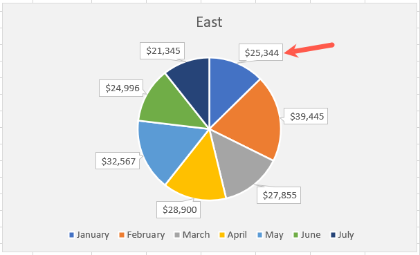
A great example of a chart that can benefit from data labels is a pie chart . Although you can use a legend for the pieces of the pie, you can save space and create an attractive chart using data labels. We’ll use a pie chart for our example.
Related: How to Make a Pie Chart in Microsoft Excel
Select your pie chart and go to the Chart Design tab that displays. Open the Add Chart Element drop-down menu in the Chart Layouts section of the ribbon.

Move your cursor to Data Labels and choose a position in the pop-out menu. For a pie chart, you’ll see options like center, inside end, outside end, best fit, and data callout. The available positions may differ depending on the chart type you use.
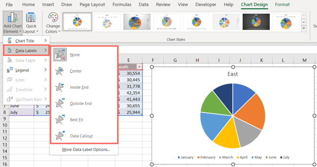
If you’re using Excel on Windows, you have an additional way to include data labels on your chart. Select the chart and then click the Chart Elements button (+) in the top right or left corner.
Check the box for Data Labels and use the arrow to the right to pick their positions from the pop-out menu.
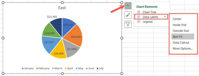
Once you see your data labels on the chart, you can experiment with different positions to get the look you want.
Adjust the Data Label Details
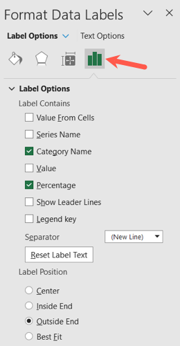
After you add your data labels, you can choose which details to include, such as a category name, a value or percentage, or data from specific cells .
Select the chart and return to the Add Chart Element drop-down menu on the Chart Design tab. Move your cursor to Data Labels and pick “More Data Label Options.”
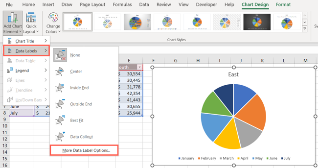
When the Format Data Labels sidebar opens, confirm that you’re on the Label Options tab. You can then expand the Label Options section beneath and mark the details you want to display.
You can also include leader lines, add a legend key, and pick a separator type.
Customize the Data Labels
Along with the details you want to include in your data labels, you can change their appearance in the Format Data Labels sidebar.
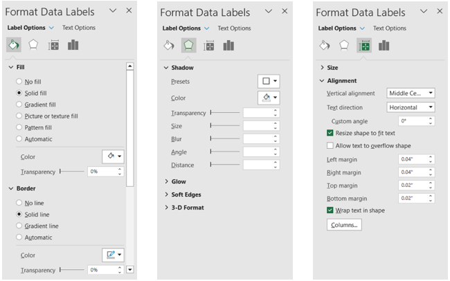
At the top of the sidebar, use the different tabs to make your changes. Keep in mind the options vary depending on the data label type. For instance, you can change the fill color and adjust the transparency for data callouts. Other customization options include:
- Fill & Line: Add a fill color or border and change the transparency.
- Effects: Create a shadow, glow, or 3-D effect.
- Size & Properties: Adjust the width and height, change the vertical alignment or text direction, and wrap the text.
Once you add your data labels, you may be able to adjust other parts of your chart. For example, you may want to remove the legend or reposition the chart title.
If you want to remove the data labels later, simply return to Chart Design > Add Chart Elements and choose “None” for Data Labels.
With data labels, you can give your chart viewers a quick and easy way to read parts of your chart at a glance. For more help with charts in Excel, check out how to create a chart template or how to rename a data series .
Also read:
- [New] 2024 Approved Masterclass 6 Techniques for Clear, Unblemished Photo Edits
- [New] 2024 Approved State-of-the-Art Gaming Capture Systems, Not Just FBX Files
- [Updated] In 2024, Illuminating the World of Photography with Adobe's HDR Techniques
- Complete Guide For Apple iPhone 14 Plus Lock Screen | Dr.fone
- Customizing ChatGPT for Specific Needs: An In-Depth Creation Guide
- Dividing Recordings Top Cam Scrutiny Review
- Mastering the Art of iPhone N 8 Screen Captures: Discover the Top Three Strategies
- The Hunting Game Reversed in 'Frozen Ground' DVD Release
- The Ultimate Resource for Contacting Snapchat Support Services
- Top 8 Methods for Converting MOV Files Into WAV Format: A Comprehensive Guide
- Top 8 Solutions: How to Resolve Your PC/Mac Video Playback Issues
- Top No-Cost Arte Video Downloader: Seamless Access to High-Quality Arte Streams at Zero Price
- Title: Enhance Your Excel Visualizations: Adding Personalized Data Labels Easily!
- Author: David
- Created at : 2025-01-02 19:25:06
- Updated at : 2025-01-06 18:51:37
- Link: https://win11.techidaily.com/enhance-your-excel-visualizations-adding-personalized-data-labels-easily/
- License: This work is licensed under CC BY-NC-SA 4.0.