6 Polarizing Windows Features That Are Gone for Good

6 Polarizing Windows Features That Are Gone for Good
Quick Links
- Windows 10: Timeline
- Windows 10: Cortana
- Windows 8: Live Tiles / The Metro Interface
- Windows 7: The Aero Theme
- Windows XP: The Classic Theme
- Windows 98: Active Desktop
Not everyone will love what Microsoft puts into Windows. In fact, several features have caused a great deal of division and debate among users. We are going to look at five of them that Microsoft eventually removed.
1 Windows 10: Timeline
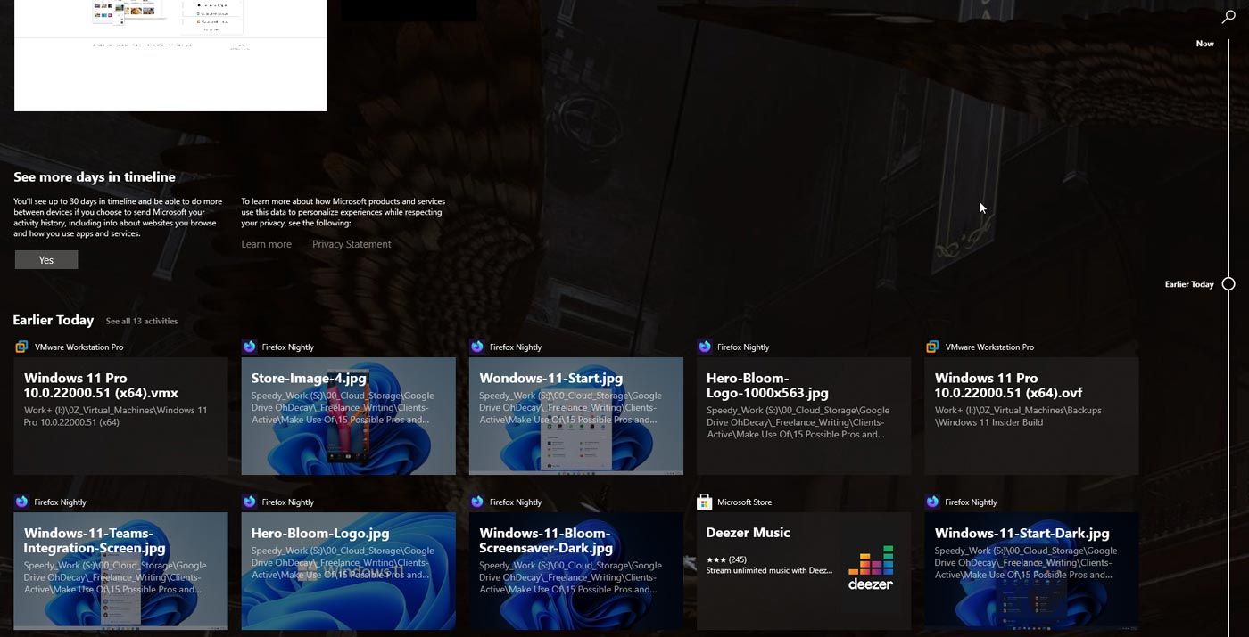
The idea behind Timeline, a window that allows you to access your recently opened apps, documents, and websites, seemed innovative. However, some users didn’t like it because it felt redundant. There was no need to use Timeline when many apps that supported it, like Word, Excel, and Edge, had built-in features to open recent files and websites.
The biggest turn-off was when Microsoft removed cross-device syncing. This feature uploads your activity history to your Microsoft account, allowing you to access recently used items on devices linked to the account. With cross-device syncing, you could start working on a Word document on your desktop or Android device and pick up where you left off on your laptop.
However, with its removal, even many who vouched for Timeline as a great productivity tool found it to be a former shell of itself. Timeline was eventually deprecated in 2021, and it did not make its way to Windows 11.
2 Windows 10: Cortana
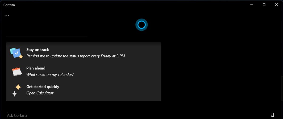
Cortana received a lot of criticism for not being as accurate as Siri, Alexa, and Google Assistant when interpreting voice commands. Couple that with its lack of third-party integrations (other apps couldn’t take advantage of Cortana’s voice assistant shortcuts), and making a case for it was quite hard.
Some users also didn’t see the need for a voice assistant on Windows since it was usually faster to find what you needed using your mouse and keyboard. With Cortana’s shortcomings, being pre-installed in Windows 10 made it even more polarizing. Users didn’t appreciate having the feature forced on them. It also couldn’t be disabled and was always listening, which raised privacy concerns.
Eventually, Microsoft allowed users to disable Cortana and no longer urged people to use it.
3 Windows 8: Live Tiles / The Metro Interface
 TubeDigger - online video downloader from mostly any site
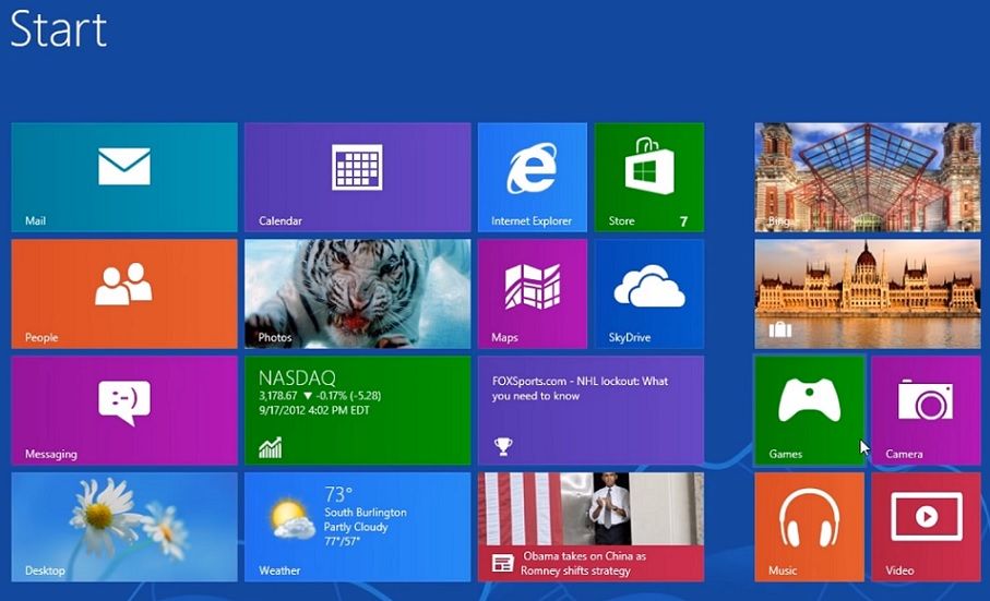
People found the Metro interface difficult to get used to. It was touchscreen-focused, which was not intuitive for desktop users, especially since touchscreen laptops didn’t take off the way some expected. While those with a Windows tablet or touchscreen laptop found it user-friendly, it was frustrating to use without touch input.
For anyone who disliked the Metro design, Live Tiles didn’t help. They were meant to display real-time information, including news, weather, and notifications. However, they didn’t work as advertised and had a noticeable performance impact.
4 Windows 7: The Aero Theme
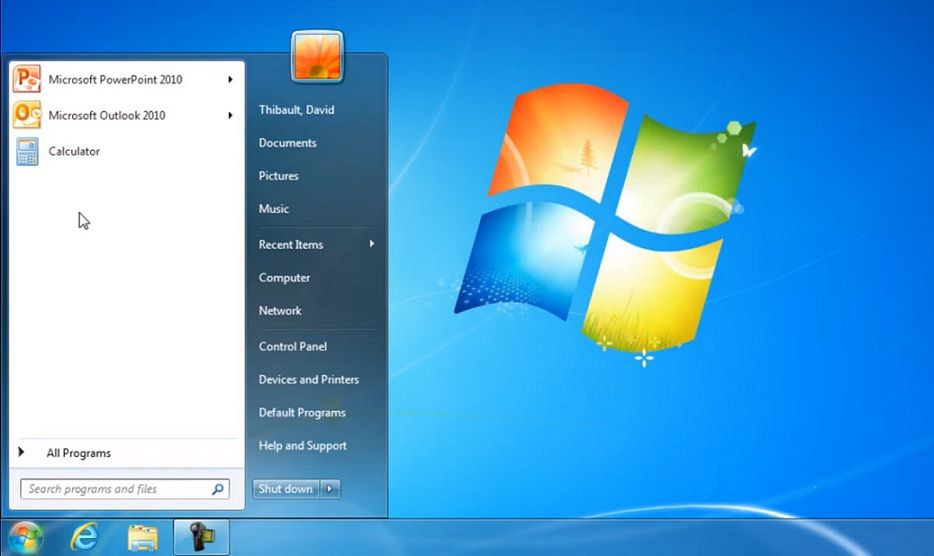
The Aero theme, which Microsoft introduced with Windows Vista and carried over to Windows 7, made windows, the taskbar, and other UI elements semi-transparent. App windows also had glasslike borders, live previews, and fluid transition animations. The theme’s slickness made Windows 7 enjoyable to look at and use, so why did some users hate it?
Well, everything that made the Aero theme great was graphically demanding for many computers at the time. People who didn’t have a great CPU and GPU had a terrible time with it. Luckily, you could disable the theme.
5 Windows XP: The Classic Theme
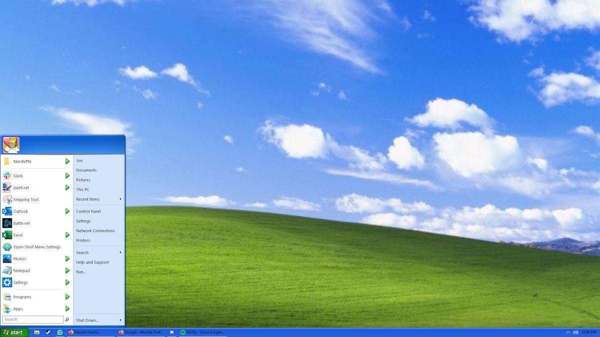
When Microsoft released Windows XP with all its enhancements and improvements, those coming from Windows 95, 98, and 2000 were glad it included the classic theme. However, others considered the minimalistic design simple, bland, and dated, even though it was better for performance.
The classic theme divided those new to Windows and those who came from previous versions. New users liked the vibrant and modern design of the default theme. The people who upgraded from prior versions found it childish and unprofessional—many even said it looked like a Fisher-Price toy .
6 Windows 98: Active Desktop
Active Desktop was a feature that allowed users to render web pages and other HTML content on the desktop. Some people didn’t like it because it was resource-intensive and impacted performance, causing the computer to become sluggish or even freeze and crash.
Of course, while some disliked these features, there were people who loved them. Regardless, Microsoft has ended support or removed them from Windows because they didn’t catch on. Other examples include Steps Recorder, WordPad, Mail, Calendar, and Windows Subsystem for Android , which future Windows users won’t get to enjoy.
Not everyone will love what Microsoft puts into Windows. In fact, several features have caused a great deal of division and debate among users. We are going to look at five of them that Microsoft eventually removed.
1 Windows 10: Timeline

The idea behind Timeline, a window that allows you to access your recently opened apps, documents, and websites, seemed innovative. However, some users didn’t like it because it felt redundant. There was no need to use Timeline when many apps that supported it, like Word, Excel, and Edge, had built-in features to open recent files and websites.
The biggest turn-off was when Microsoft removed cross-device syncing. This feature uploads your activity history to your Microsoft account, allowing you to access recently used items on devices linked to the account. With cross-device syncing, you could start working on a Word document on your desktop or Android device and pick up where you left off on your laptop.
However, with its removal, even many who vouched for Timeline as a great productivity tool found it to be a former shell of itself. Timeline was eventually deprecated in 2021, and it did not make its way to Windows 11.
2 Windows 10: Cortana

Cortana received a lot of criticism for not being as accurate as Siri, Alexa, and Google Assistant when interpreting voice commands. Couple that with its lack of third-party integrations (other apps couldn’t take advantage of Cortana’s voice assistant shortcuts), and making a case for it was quite hard.
Some users also didn’t see the need for a voice assistant on Windows since it was usually faster to find what you needed using your mouse and keyboard. With Cortana’s shortcomings, being pre-installed in Windows 10 made it even more polarizing. Users didn’t appreciate having the feature forced on them. It also couldn’t be disabled and was always listening, which raised privacy concerns.
Eventually, Microsoft allowed users to disable Cortana and no longer urged people to use it.
3 Windows 8: Live Tiles / The Metro Interface

People found the Metro interface difficult to get used to. It was touchscreen-focused, which was not intuitive for desktop users, especially since touchscreen laptops didn’t take off the way some expected. While those with a Windows tablet or touchscreen laptop found it user-friendly, it was frustrating to use without touch input.
For anyone who disliked the Metro design, Live Tiles didn’t help. They were meant to display real-time information, including news, weather, and notifications. However, they didn’t work as advertised and had a noticeable performance impact.
 Glarysoft File Recovery Pro - Helps to recover your lost file/data, even permanently deleted data.
4 Windows 7: The Aero Theme

The Aero theme, which Microsoft introduced with Windows Vista and carried over to Windows 7, made windows, the taskbar, and other UI elements semi-transparent. App windows also had glasslike borders, live previews, and fluid transition animations. The theme’s slickness made Windows 7 enjoyable to look at and use, so why did some users hate it?
Well, everything that made the Aero theme great was graphically demanding for many computers at the time. People who didn’t have a great CPU and GPU had a terrible time with it. Luckily, you could disable the theme.
5 Windows XP: The Classic Theme

When Microsoft released Windows XP with all its enhancements and improvements, those coming from Windows 95, 98, and 2000 were glad it included the classic theme. However, others considered the minimalistic design simple, bland, and dated, even though it was better for performance.
The classic theme divided those new to Windows and those who came from previous versions. New users liked the vibrant and modern design of the default theme. The people who upgraded from prior versions found it childish and unprofessional—many even said it looked like a Fisher-Price toy .
6 Windows 98: Active Desktop
Active Desktop was a feature that allowed users to render web pages and other HTML content on the desktop. Some people didn’t like it because it was resource-intensive and impacted performance, causing the computer to become sluggish or even freeze and crash.
Of course, while some disliked these features, there were people who loved them. Regardless, Microsoft has ended support or removed them from Windows because they didn’t catch on. Other examples include Steps Recorder, WordPad, Mail, Calendar, and Windows Subsystem for Android , which future Windows users won’t get to enjoy.
Not everyone will love what Microsoft puts into Windows. In fact, several features have caused a great deal of division and debate among users. We are going to look at five of them that Microsoft eventually removed.
1 Windows 10: Timeline

The idea behind Timeline, a window that allows you to access your recently opened apps, documents, and websites, seemed innovative. However, some users didn’t like it because it felt redundant. There was no need to use Timeline when many apps that supported it, like Word, Excel, and Edge, had built-in features to open recent files and websites.
The biggest turn-off was when Microsoft removed cross-device syncing. This feature uploads your activity history to your Microsoft account, allowing you to access recently used items on devices linked to the account. With cross-device syncing, you could start working on a Word document on your desktop or Android device and pick up where you left off on your laptop.
However, with its removal, even many who vouched for Timeline as a great productivity tool found it to be a former shell of itself. Timeline was eventually deprecated in 2021, and it did not make its way to Windows 11.
2 Windows 10: Cortana

Cortana received a lot of criticism for not being as accurate as Siri, Alexa, and Google Assistant when interpreting voice commands. Couple that with its lack of third-party integrations (other apps couldn’t take advantage of Cortana’s voice assistant shortcuts), and making a case for it was quite hard.
Some users also didn’t see the need for a voice assistant on Windows since it was usually faster to find what you needed using your mouse and keyboard. With Cortana’s shortcomings, being pre-installed in Windows 10 made it even more polarizing. Users didn’t appreciate having the feature forced on them. It also couldn’t be disabled and was always listening, which raised privacy concerns.
Eventually, Microsoft allowed users to disable Cortana and no longer urged people to use it.
3 Windows 8: Live Tiles / The Metro Interface

People found the Metro interface difficult to get used to. It was touchscreen-focused, which was not intuitive for desktop users, especially since touchscreen laptops didn’t take off the way some expected. While those with a Windows tablet or touchscreen laptop found it user-friendly, it was frustrating to use without touch input.
For anyone who disliked the Metro design, Live Tiles didn’t help. They were meant to display real-time information, including news, weather, and notifications. However, they didn’t work as advertised and had a noticeable performance impact.
4 Windows 7: The Aero Theme

The Aero theme, which Microsoft introduced with Windows Vista and carried over to Windows 7, made windows, the taskbar, and other UI elements semi-transparent. App windows also had glasslike borders, live previews, and fluid transition animations. The theme’s slickness made Windows 7 enjoyable to look at and use, so why did some users hate it?
Well, everything that made the Aero theme great was graphically demanding for many computers at the time. People who didn’t have a great CPU and GPU had a terrible time with it. Luckily, you could disable the theme.
5 Windows XP: The Classic Theme

When Microsoft released Windows XP with all its enhancements and improvements, those coming from Windows 95, 98, and 2000 were glad it included the classic theme. However, others considered the minimalistic design simple, bland, and dated, even though it was better for performance.
The classic theme divided those new to Windows and those who came from previous versions. New users liked the vibrant and modern design of the default theme. The people who upgraded from prior versions found it childish and unprofessional—many even said it looked like a Fisher-Price toy .
6 Windows 98: Active Desktop
Active Desktop was a feature that allowed users to render web pages and other HTML content on the desktop. Some people didn’t like it because it was resource-intensive and impacted performance, causing the computer to become sluggish or even freeze and crash.
Of course, while some disliked these features, there were people who loved them. Regardless, Microsoft has ended support or removed them from Windows because they didn’t catch on. Other examples include Steps Recorder, WordPad, Mail, Calendar, and Windows Subsystem for Android , which future Windows users won’t get to enjoy.
Not everyone will love what Microsoft puts into Windows. In fact, several features have caused a great deal of division and debate among users. We are going to look at five of them that Microsoft eventually removed.
1 Windows 10: Timeline

 dotConnect for Oracle is an ADO.NET data provider for Oracle with Entity Framework Support.
The idea behind Timeline, a window that allows you to access your recently opened apps, documents, and websites, seemed innovative. However, some users didn’t like it because it felt redundant. There was no need to use Timeline when many apps that supported it, like Word, Excel, and Edge, had built-in features to open recent files and websites.
The biggest turn-off was when Microsoft removed cross-device syncing. This feature uploads your activity history to your Microsoft account, allowing you to access recently used items on devices linked to the account. With cross-device syncing, you could start working on a Word document on your desktop or Android device and pick up where you left off on your laptop.
However, with its removal, even many who vouched for Timeline as a great productivity tool found it to be a former shell of itself. Timeline was eventually deprecated in 2021, and it did not make its way to Windows 11.
2 Windows 10: Cortana

Cortana received a lot of criticism for not being as accurate as Siri, Alexa, and Google Assistant when interpreting voice commands. Couple that with its lack of third-party integrations (other apps couldn’t take advantage of Cortana’s voice assistant shortcuts), and making a case for it was quite hard.
Some users also didn’t see the need for a voice assistant on Windows since it was usually faster to find what you needed using your mouse and keyboard. With Cortana’s shortcomings, being pre-installed in Windows 10 made it even more polarizing. Users didn’t appreciate having the feature forced on them. It also couldn’t be disabled and was always listening, which raised privacy concerns.
Eventually, Microsoft allowed users to disable Cortana and no longer urged people to use it.
3 Windows 8: Live Tiles / The Metro Interface

People found the Metro interface difficult to get used to. It was touchscreen-focused, which was not intuitive for desktop users, especially since touchscreen laptops didn’t take off the way some expected. While those with a Windows tablet or touchscreen laptop found it user-friendly, it was frustrating to use without touch input.
For anyone who disliked the Metro design, Live Tiles didn’t help. They were meant to display real-time information, including news, weather, and notifications. However, they didn’t work as advertised and had a noticeable performance impact.
 Allavsoft Batch Download Online Videos, Music Offline to MP4, MP3, MOV, etc format
4 Windows 7: The Aero Theme

The Aero theme, which Microsoft introduced with Windows Vista and carried over to Windows 7, made windows, the taskbar, and other UI elements semi-transparent. App windows also had glasslike borders, live previews, and fluid transition animations. The theme’s slickness made Windows 7 enjoyable to look at and use, so why did some users hate it?
Well, everything that made the Aero theme great was graphically demanding for many computers at the time. People who didn’t have a great CPU and GPU had a terrible time with it. Luckily, you could disable the theme.
5 Windows XP: The Classic Theme

When Microsoft released Windows XP with all its enhancements and improvements, those coming from Windows 95, 98, and 2000 were glad it included the classic theme. However, others considered the minimalistic design simple, bland, and dated, even though it was better for performance.
The classic theme divided those new to Windows and those who came from previous versions. New users liked the vibrant and modern design of the default theme. The people who upgraded from prior versions found it childish and unprofessional—many even said it looked like a Fisher-Price toy .
6 Windows 98: Active Desktop
Active Desktop was a feature that allowed users to render web pages and other HTML content on the desktop. Some people didn’t like it because it was resource-intensive and impacted performance, causing the computer to become sluggish or even freeze and crash.
Of course, while some disliked these features, there were people who loved them. Regardless, Microsoft has ended support or removed them from Windows because they didn’t catch on. Other examples include Steps Recorder, WordPad, Mail, Calendar, and Windows Subsystem for Android , which future Windows users won’t get to enjoy.
- Title: 6 Polarizing Windows Features That Are Gone for Good
- Author: David
- Created at : 2024-08-15 23:22:19
- Updated at : 2024-08-16 23:22:19
- Link: https://win11.techidaily.com/6-polarizing-windows-features-that-are-gone-for-good/
- License: This work is licensed under CC BY-NC-SA 4.0.



 LYRX is an easy-to-use karaoke software with the professional features karaoke hosts need to perform with precision. LYRX is karaoke show hosting software that supports all standard karaoke file types as well as HD video formats, and it’s truly fun to use.
 CalendarBudget - Monthly subscription membership to CalendarBudget via web browser or mobile app. Support included.